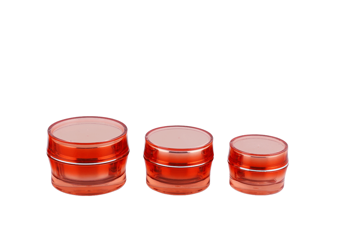
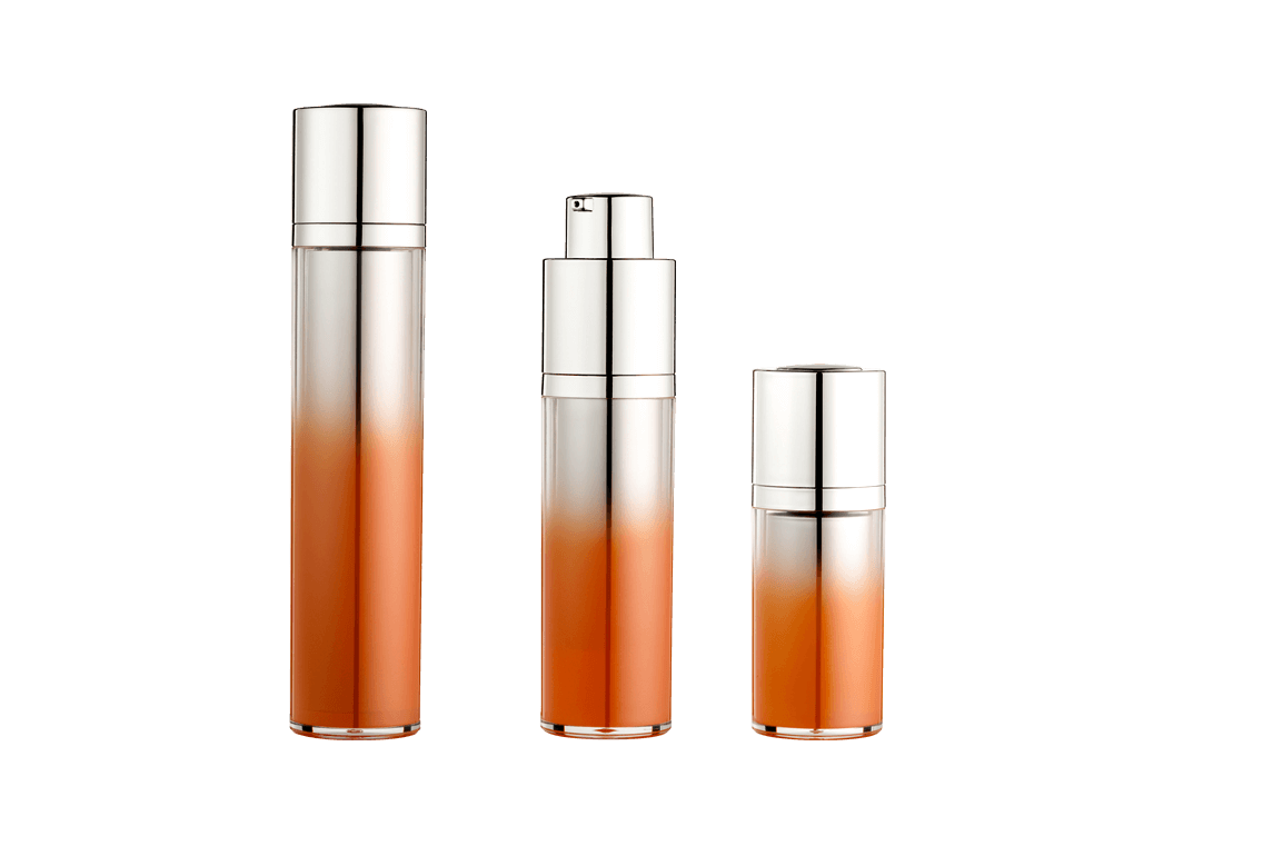
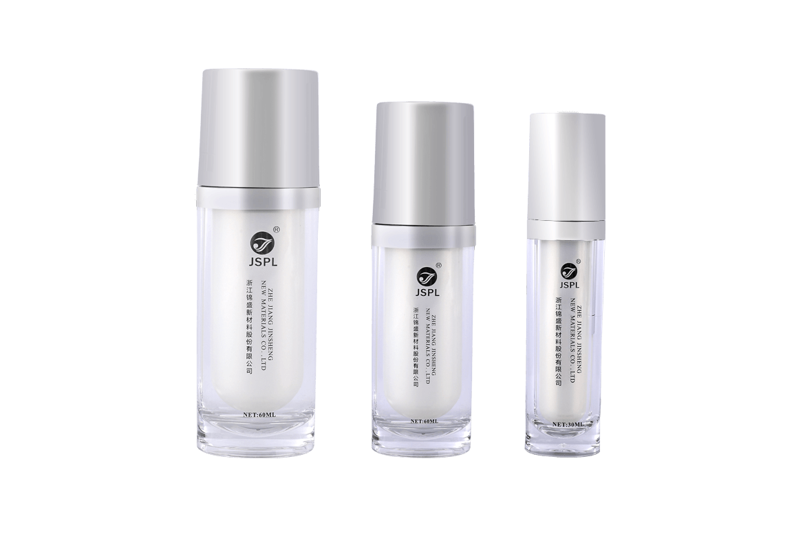
If you need some packaging design inspiration, there is no better starting point than to start researching the latest cosmetic packaging trends. Once you understand the current trends, you can create packaging to cater to current issues that are important to customers and communicate with them in the right way.
Remember, you want to choose a look that is both modern and popular, but also timeless and universally appealing, so your packaging design should be kept up to date for as long as possible.
The following are cosmetic packaging trends that we can see everywhere now:
1. Complex line drawings
The use of fine lines and lots of details to make complex drawings is an eternal beauty trend in cosmetic packaging. Especially flowers and hand-drawn drawings work well and can be cleverly placed in specific areas or cover the entire product. If you want something feminine, but you want something elegant and refined, then a more geometric, clean and cool painting style may suit you. If your brand pays attention to details, or you are looking for a subtle and beautiful way to display the items in the package (by drawing the ingredients used), this trend is perfect for you.
2. Unique custom font
The bold font trend we see in graphic design naturally extends to packaging. Unique fonts can make your packaging have many characteristics. Typography is the perfect way to express you as a brand, and processed fonts can make you unique. Whether it has a retro vibe, bold statement or quirky style, unique fonts will definitely stay in people's minds.
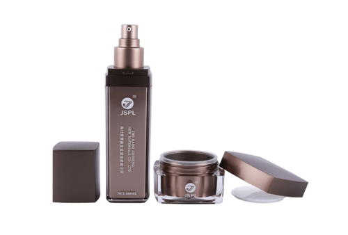
3. Eye-catching eye-catching patterns
Loud stripes and versatile color combinations, bold pattern trends will make your packaging immediately off the shelf. The layout is reasonable and the eye-catching patterns make your packaging popular, and give the brand a confident, youthful appearance, making you unique. Especially irregular patterns are a recurring trend, which can give your packaging certain advantages. But this does not mean that your brand must be young and loud to use this trend: as long as you choose the correct colors and shapes, abstract patterns can be applied to any brand.
4. Earthy colors
One fashion retro trend that we cannot fully understand is cosmetic packaging, covered with rich, warm flowers and natural earth tones. Although this trend has a feminine and sometimes sexy feeling, it can also feel warm and comfortable. The combination of lush, rich floral illustrations and simple typography forms a classic style, creating an approachable and luxurious look.
5. Modern and simple
Softness and minimalism are a match for heaven. Crayons can soften the simple packaging design that originally looked rough, while the simple and clean design will ensure that your crayon packaging looks modern and grown. Combine these two concepts to find the right combination for your brand. You can keep it simple and stylish by choosing a pastel tone that can speak to your customers and brand, or you can combine pastel tones to achieve a playful and dreamy look.

 Chinese
 España
 Italia
 Le français
