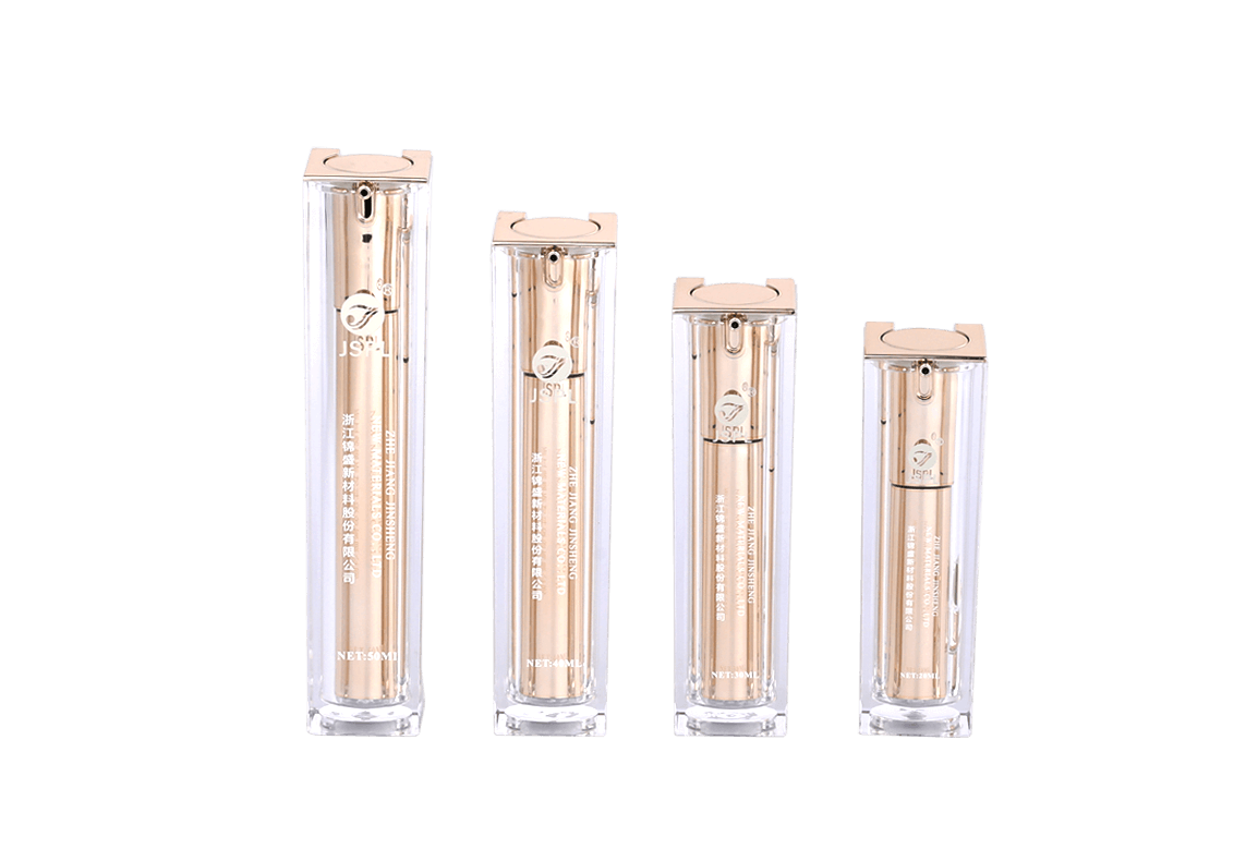
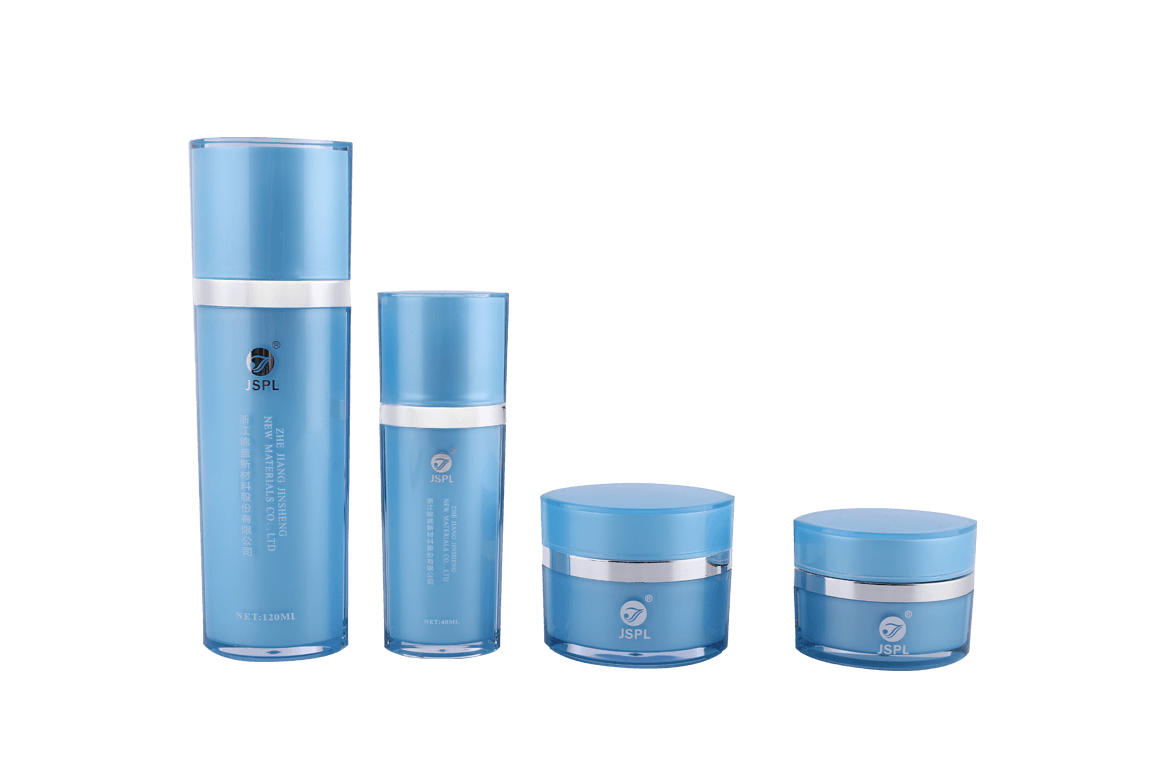
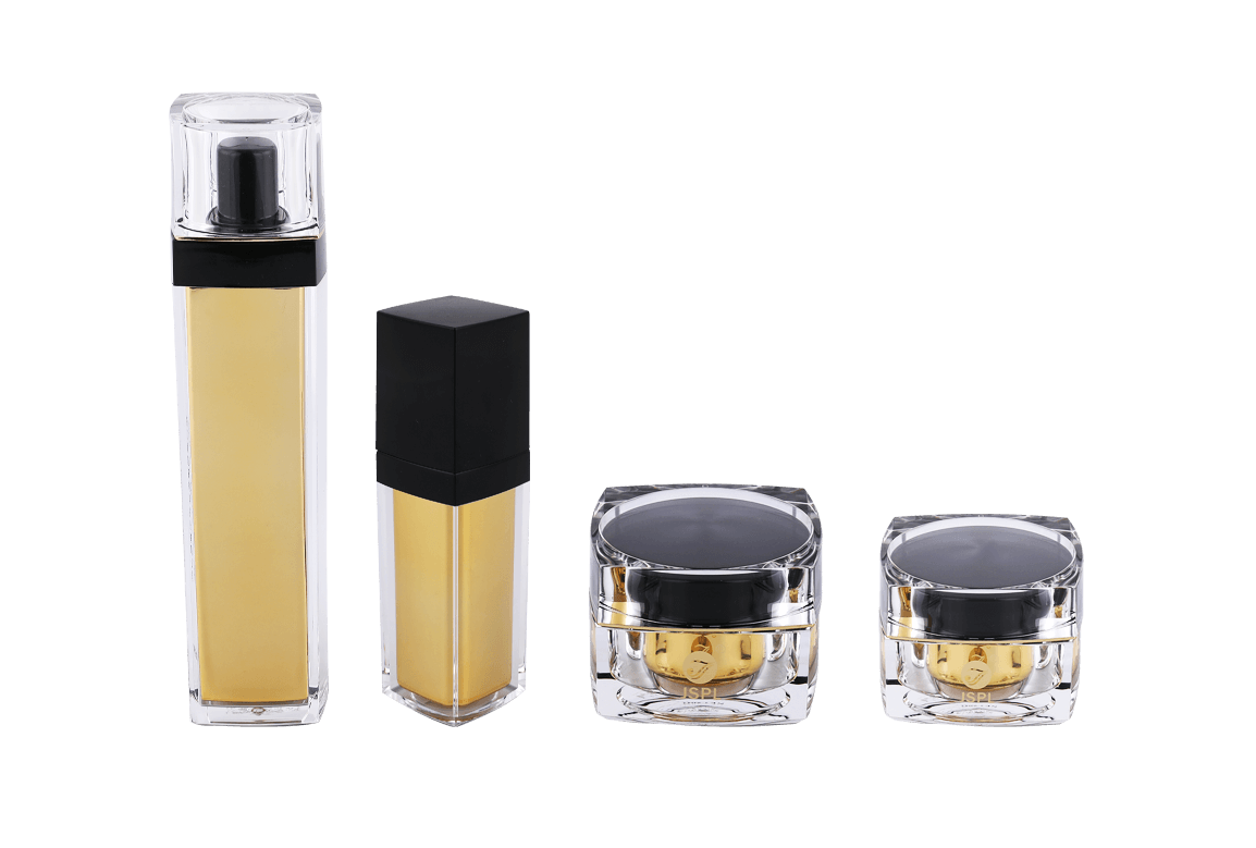
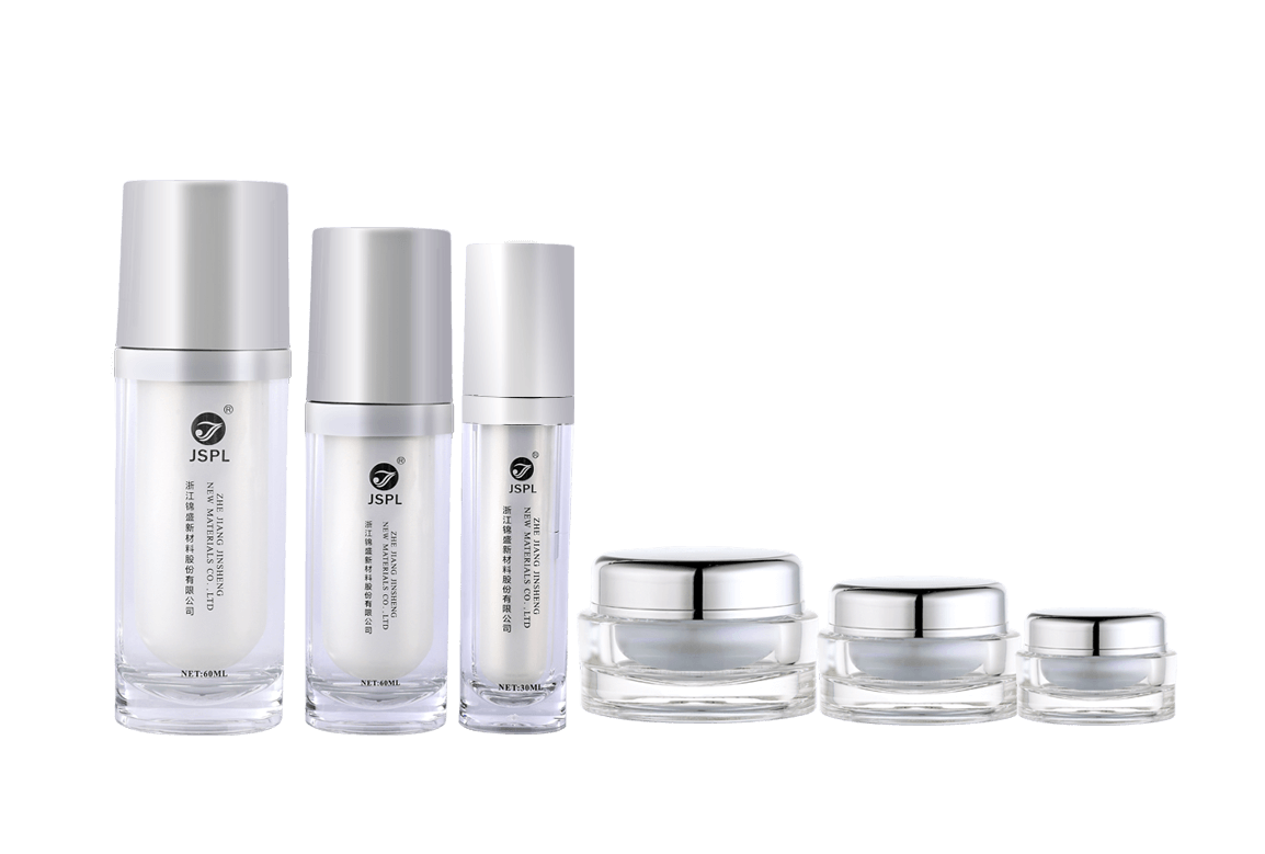
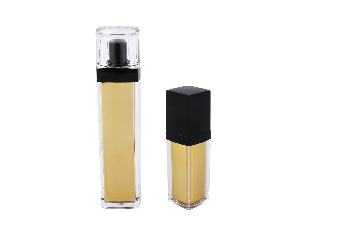
In the cosmetics industry, the label design of plastic cosmetic jars is not only a visual element, but also an important carrier of brand image, product information and communication with consumers. Therefore, label design needs to comprehensively consider multiple dimensions such as regulatory compliance, market trends, consumer demand and brand positioning, so as to achieve a perfect combination of function and beauty.
Regulatory compliance
The first task of label design is to ensure compliance with relevant laws and regulations. There are significant differences in the requirements for cosmetic labels in different countries and regions. For example, the list of ingredients must be listed in order from high to low content and follow the International Nomenclature of Cosmetic Ingredients (INCI) standard. In addition, if the product contains ingredients that may cause allergic or irritating reactions, warning information must be clearly marked on the label. Instructions for use should also not be ignored. The label should provide clear information such as how to use, suitable skin types and precautions. At the same time, the marking of the production batch number and expiration date is also essential to ensure that consumers can trace the source of the product and ensure safe use. Compliance with these regulations can not only effectively reduce legal risks, but also enhance consumers' trust in the brand, thereby enhancing the brand image.
Information clarity
The information on the label must be clear to ensure that consumers can quickly obtain the required information. The following aspects should be paid attention to when designing: First, the choice of font is crucial. Clear and easy-to-read fonts should be used, and styles that are too fancy or difficult to recognize should be avoided. The font size should be moderate to ensure that it is readable at different viewing distances and lighting conditions. Secondly, the design of information hierarchy is equally important, and different font sizes, weights and colors are used to distinguish important information from secondary information. For example, the product name should be highlighted, while the ingredient list can be presented in a smaller font. Finally, a reasonable layout can effectively avoid information crowding and confusion, and appropriate blank areas can improve readability and visual comfort.
Visual appeal
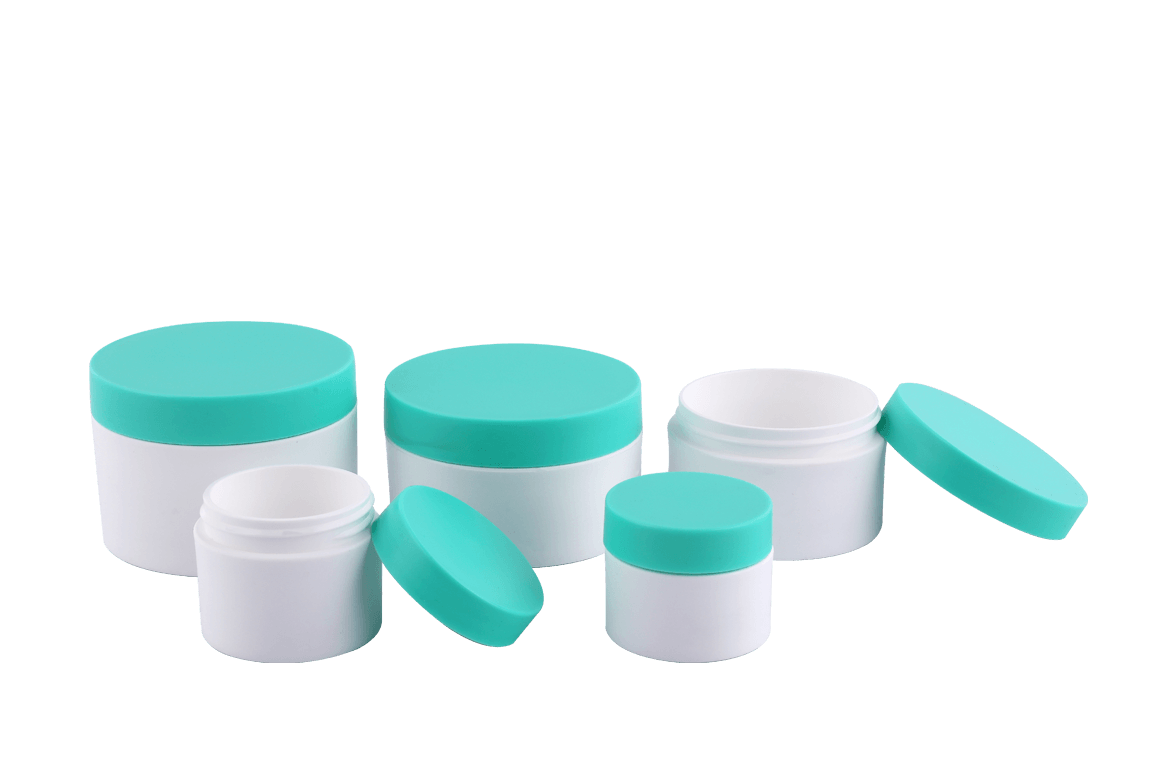
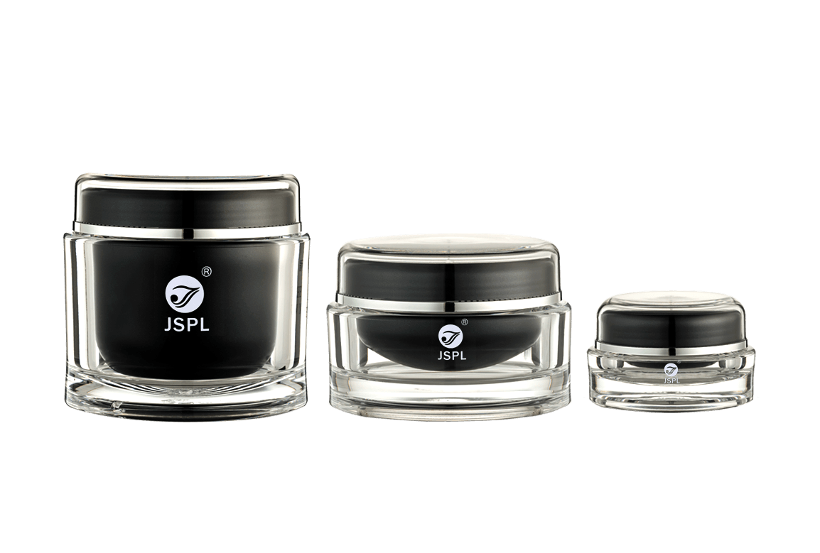
In a highly competitive market environment, the visual design of the label is particularly important. A beautifully designed and visually attractive label can significantly enhance the market competitiveness of the product. During the design process, the rationality of color matching should be considered, and colors that are consistent with the brand image and product characteristics should be selected. Color not only affects consumers' first impressions, but also conveys the emotions and values of the brand. For example, green is often associated with nature and environmental protection, while black conveys a sense of luxury and high-end.
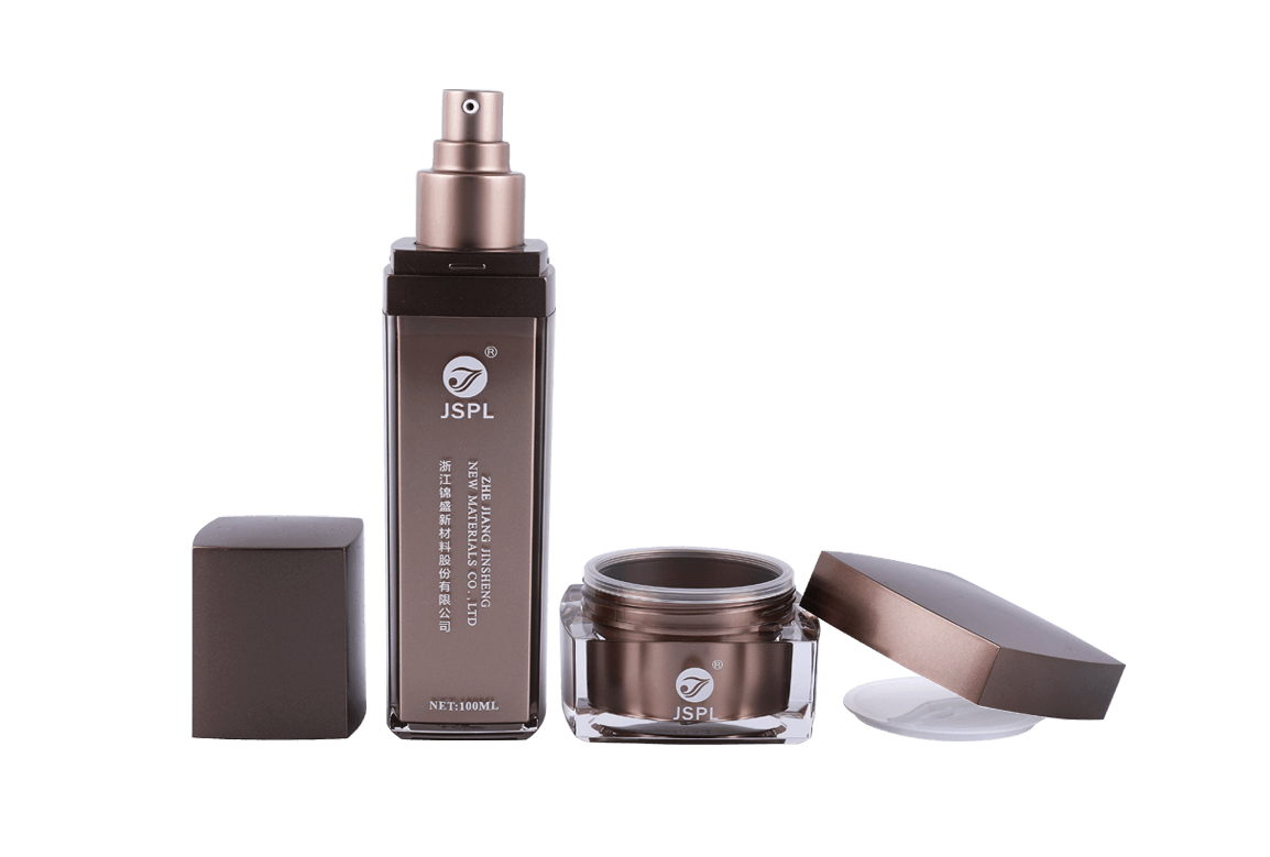
In addition, appropriate graphics and images can enhance the visual appeal of the label, but it is necessary to ensure that these elements do not interfere with the communication of key information. The image should be consistent with the product characteristics and brand image to enhance the coordination of the overall design. At the same time, the display of the brand logo (such as the LOGO) should also be prominent to improve the brand's recognition. Ensuring the coordination of the brand logo with the overall design style can further enhance consumers' recognition and memory of the brand.

 Chinese
 España
 Italia
 Le français